其他图表格式的设置
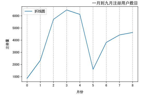
1> 网格线设置
# 网格线设置
x = np.arange(9)
y = np.array([866, 2335, 5710, 6482, 6120, 1605, 3813, 4428, 4631])
plt.plot(x,y)
plt.xlabel('月份',labelpad = 10, fontproperties = my_font)
plt.ylabel('注册量',labelpad = 10, fontproperties = my_font)
# plt.grid(b = 'True')
plt.grid(b = 'True',axis='x',linestyle = 'dashed',linewidth = 1)
plt.show()

2> 设置图例
| loc参数的参数值 | 位置代码 | 说明 |
|---|---|---|
| best | 0 | 根据图表区域自动选择最合适的展示位置 |
| upper right | 1 | 图例显示在右上角 |
| upper left | 2 | 图例显示在左上角 |
| lower left | 3 | 图例显示在左下角 |
| lower right | 4 | 图例显示在右下角 |
| right | 5 | 图例显示在右侧 |
| center left | 6 | 图例显示在左侧中心位置 |
| center right | 7 | 图例显示在右侧中心位置 |
| lower center | 8 | 图例显示在底部中心位置 |
| upper center | 9 | 图例显示在顶部中心位置 |
| center | 10 | 图例显示在正中心位置 |
legend 其他几个参数
| 参数值 | 说明 |
|---|---|
| fontsize | 图例字号大小 |
| prop | 关于文本的相关设置,以字典形式传给参数 prop |
| facecolor | 图例框的背景颜色 |
| edgecolor | 图例框的边框颜色 |
| title | 图例标题 |
| title_fontsize | 图例标题的大小 |
| shadow | 是否给图例框添加阴影,默认为 False |
x = np.arange(9)
y = np.array([866, 2335, 5710, 6482, 6120, 1605, 3813, 4428, 4631])
plt.plot(x,y,label = '折线图')
plt.xlabel('月份',labelpad = 10)
plt.ylabel('注册量',labelpad = 10)
plt.grid(b = 'True',axis='x',linestyle = 'dashed',linewidth = 1)
plt.legend(prop = my_font,loc = 'upper left')
plt.show()

3> 图表标题设置
x = np.arange(9)
y = np.array([866, 2335, 5710, 6482, 6120, 1605, 3813, 4428, 4631])
plt.plot(x,y,label = '折线图')
plt.xlabel('月份',labelpad = 10)
plt.ylabel('注册量',labelpad = 10)
plt.grid(b = 'True',axis='x',linestyle = 'dashed',linewidth = 1)
plt.legend(prop = my_font,loc = 'upper left')
# 标题设置
plt.title(label = '一月到九月注册用户数目',loc='right')
plt.show()
| loc参数值 | 说明 |
|---|---|
| center | 居中显示 |
| left | 靠左显示 |
| right | 靠右显示 |
4> 设置数据标签
plt.text(x, y, ha, va, fontsize)
| 参数值 | 说明 |
|---|---|
| 参数(x,y) | 分别表示在哪里显示数值 |
| str | 要显示的具体数值 |
| horizontalalignment | 简称 ha,表示 str在水平方向的位置,可选参数有 center、right、left |
| verticalalignment | 简称 va,表示 str在垂直方向的位置,可选参数有 center、right、left |
| fontsize | 设置 str 字体的大小 |
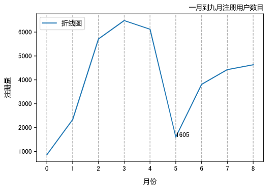
x = np.arange(9)
y = np.array([866, 2335, 5710, 6482, 6120, 1605, 3813, 4428, 4631])
plt.plot(x,y,label = '折线图')
plt.xlabel('月份',labelpad = 10)
plt.ylabel('注册量',labelpad = 10)
plt.xlabel('月份',labelpad = 10)
plt.ylabel('注册量',labelpad = 10)
plt.grid(b = 'True',axis='x',linestyle = 'dashed',linewidth = 1)
plt.legend(prop = my_font,loc = 'upper left')
plt.title(label = '一月到九月注册用户数目',loc='right')
# 设置单个数据标签
plt.text(5,1605,1605)
plt.show()
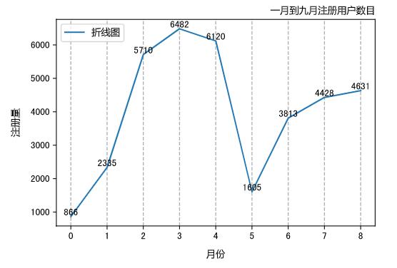
x = np.arange(9)
y = np.array([866, 2335, 5710, 6482, 6120, 1605, 3813, 4428, 4631])
plt.plot(x,y,label = '折线图')
plt.xlabel('月份',labelpad = 10)
plt.ylabel('注册量',labelpad = 10)
plt.xlabel('月份',labelpad = 10)
plt.ylabel('注册量',labelpad = 10)
plt.grid(b = 'True',axis='x',linestyle = 'dashed',linewidth = 1)
plt.legend(prop = my_font,loc = 'upper left')
plt.title(label = '一月到九月注册用户数目',loc='right')
# 所有点添加数据标签
for a,b in zip(x,y):
    plt.text(a, b, b, ha = 'center', va = 'bottom', fontsize = 10)
plt.show()
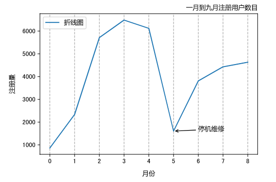
5> 图表注释
plt.annotate(s, xy, xytext, arrowprops)
| 参数 | 说明 |
|---|---|
| s | 表示要注释的文本内容 |
| xy | 表示要注释的位置 |
| xytext | 表示要注释的文本的显示位置 |
| arrowprops | 设置箭相关参数,颜色、箭头类型设置 |
arrowprops = dict(facecolor= 'black',arrowstyle = '->')
| 参数 | 说明 |
|---|---|
| facecolor | 颜色 |
| arrowstyle | 箭的类型: '-' '->' '-[' '<-' '<->' 'fancy' 'simple' 'wedge' |
x = np.arange(9)
y = np.array([866, 2335, 5710, 6482, 6120, 1605, 3813, 4428, 4631])
plt.plot(x,y,label = '折线图')
plt.xlabel('月份',labelpad = 10, fontproperties = my_font)
plt.ylabel('注册量',labelpad = 10, fontproperties = my_font)
plt.grid(b = 'True',axis='x',linestyle = 'dashed',linewidth = 1)
plt.legend(prop = my_font,loc = 'upper left')
plt.title(label = '一月到九月注册用户数目',fontproperties = my_font,loc='right')
# 图标注释
plt.annotate('停机维修',xy = (5,1605), xytext = (6,1605), arrowprops = dict(facecolor = 'black', arrowstyle = '->'),fontproperties = my_font)
plt.show()
6> 数据表
plt.table(cellText = None, cellColours = None, cellLoc = 'right', colWidths = None, rowLabels = None, rowColours = None, rowLoc = 'left', colLabels = None, colColours = None, colLoc = 'center', loc = 'bottom')
| 参数 | 说明 |
|---|---|
| cellText | 数据表内的值 |
| cellColours | 数据表的颜色 |
| cellLoc | 数据表中数值的位置,可选 left, right, center |
| colWidths | 列宽 |
| rowLabels | 行标签 |
| rowColours | 行标签的颜色 |
| rowLoc | 行标签的位置 |
| colLabels | 列标签 |
| colColours | 列标签的颜色 |
| colLoc | 列标签的位置 |
| loc | 整个数据表的位置,可选坐标系的上、下、左、右 |
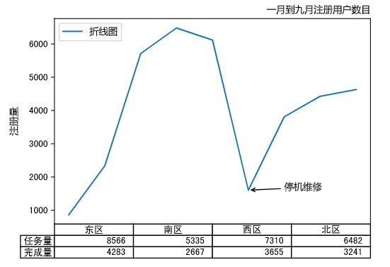
plt.plot(x,y,label = '折线图')
plt.ylabel('注册量',labelpad = 10, fontproperties = my_font)
plt.grid(b = 'True',axis='x',linestyle = 'dashed',linewidth = 1)
plt.legend(prop = my_font,loc = 'upper left')
plt.title(label = '一月到九月注册用户数目',fontproperties = my_font,loc='right')
plt.annotate('停机维修',xy = (5,1605), xytext = (6,1605), arrowprops = dict(facecolor = 'black', arrowstyle = '->'),fontproperties = my_font)
plt.tick_params(axis = 'x', which = 'both', direction = 'in', bottom = 'False')
cellText = [[8566, 5335, 7310, 6482],[4283,2667,3655,3241]]
plt.xticks([])
rows = ['任务量','完成量']
columns = ['东区', '南区', '西区', '北区']
# 添加数据表
plt.table(cellText,rowLabels = rows,colLabels = columns)
plt.show()