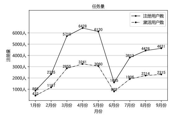
绘制组合图表
1> 折线图+折线图
x10 = np.arange(1,10)
y10_1 = np.array([866, 2335, 5710, 6428, 6120, 1605, 3813, 4428, 4631])
y10_2 = np.array([433, 1167, 2855, 3241, 3060, 802, 1906, 2214, 2315])

# 绘图
plt.plot(x10, y10_1, color = 'k', linestyle = 'solid', linewidth = 1, marker = 'o', markersize = 3, label = '注册用户数')
plt.plot(x10, y10_2, color = 'k', linestyle = 'dashdot', linewidth = 1, marker = 'o', markersize = 3, label = '激活用户数')

# 设置标题
plt.title('任务量', loc = 'center', fontproperties = my_font)

# 添加数据标签
for a,b in zip(x10,y10_1):
    plt.text(a, b, b, ha = 'center', va = 'bottom', fontsize = 10)

for a,b in zip(x10,y10_2):
    plt.text(a, b, b, ha = 'center', va = 'bottom', fontsize = 10)

# 设置轴标签
plt.xlabel('月份',fontproperties = my_font)
plt.ylabel('注册量',fontproperties = my_font)

# 设置轴刻度
plt.xticks(x10, ['1月份', '2月份', '3月份', '4月份', '5月份', '6月份', '7月份', '8月份', '9月份'], fontproperties = my_font)
plt.yticks(np.arange(1000, 7000, 1000), ['1000人', '2000人', '3000人', '4000人', '5000人', '6000人'], fontproperties = my_font)

# 显示图例
plt.legend(prop = my_font)

# 设置网格线
plt.grid(True,axis = 'y')

plt.ylim(0,8000)


# 保存视图
plt.savefig('./assets/双折线图.png')

# 显示视图
plt.show()
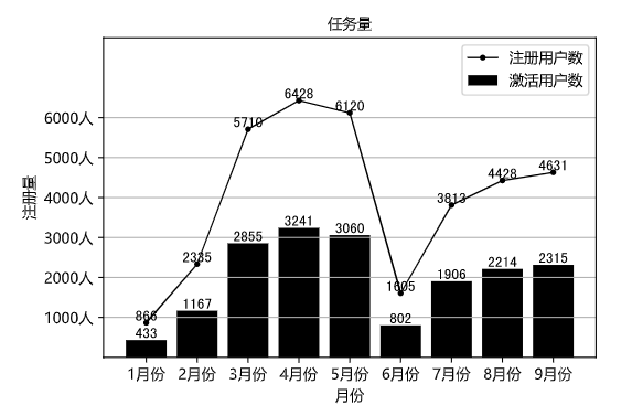
2> 折线图+柱形图
x10 = np.arange(1,10)
y10_1 = np.array([866, 2335, 5710, 6428, 6120, 1605, 3813, 4428, 4631])
y10_2 = np.array([433, 1167, 2855, 3241, 3060, 802, 1906, 2214, 2315])

# 绘图
plt.plot(x10, y10_1, color = 'k', linestyle = 'solid', linewidth = 1, marker = 'o', markersize = 3, label = '注册用户数')
plt.bar(x10, y10_2, color = 'k', label = '激活用户数')

# 设置标题
plt.title('任务量', loc = 'center', fontproperties = my_font)

# 添加数据标签
for a,b in zip(x10,y10_1):
    plt.text(a, b, b, ha = 'center', va = 'bottom', fontsize = 10)

for a,b in zip(x10,y10_2):
    plt.text(a, b, b, ha = 'center', va = 'bottom', fontsize = 10)

# 设置轴标签
plt.xlabel('月份',fontproperties = my_font)
plt.ylabel('注册量',fontproperties = my_font)

# 设置轴刻度
plt.xticks(x10, ['1月份', '2月份', '3月份', '4月份', '5月份', '6月份', '7月份', '8月份', '9月份'], fontproperties = my_font)
plt.yticks(np.arange(1000, 7000, 1000), ['1000人', '2000人', '3000人', '4000人', '5000人', '6000人'], fontproperties = my_font)

# 显示图例
plt.legend(prop = my_font)

# 设置网格线
plt.grid(True,axis = 'y')

plt.ylim(0,8000)


# 保存视图
plt.savefig('./assets/双折线图.png')

# 显示视图
plt.show()
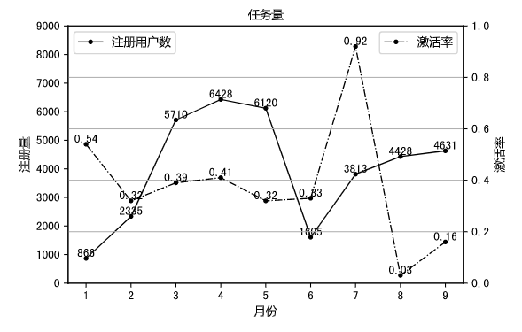
双坐标轴图表
x10 = np.arange(1,10)
y10_1 = np.array([866, 2335, 5710, 6428, 6120, 1605, 3813, 4428, 4631])
y10_2 = np.array([0.54, 0.32, 0.39, 0.41, 0.32, 0.33, 0.92, 0.03, 0.16])

# 绘制主坐标轴上的图表
plt.plot(x10, y10_1, color = 'k', linestyle = 'solid', linewidth = 1, marker = 'o', markersize = 3, label = '注册用户数')

# 设置主坐标轴标签
plt.xlabel('月份',fontproperties = my_font)
plt.ylabel('注册量',fontproperties = my_font)

# 显示图例
plt.legend(prop = my_font,loc = "upper left")


for a,b in zip(x10,y10_1):
    plt.text(a, b, b, ha = 'center', va = 'bottom', fontsize = 10)

plt.ylim(0,9000)

# 调用twins方法
plt.twinx()

# 绘制次坐标轴上的图表
plt.plot(x10, y10_2, color = 'k', linestyle = 'dashdot', linewidth = 1, marker = 'o', markersize = 3, label = '激活率')

# 添加数据标签
for a,b in zip(x10,y10_2):
    plt.text(a, b, b, ha = 'center', va = 'bottom', fontsize = 10)

# 设置次坐标轴标签
plt.xlabel('月份',fontproperties = my_font)
plt.ylabel('激活率',fontproperties = my_font)

# 显示图例
plt.legend(prop = my_font)

plt.ylim(0,1)

# 设置标题
plt.title('任务量', loc = 'center', fontproperties = my_font)

# 设置网格线
plt.grid(True,axis = 'y')

# 保存视图
plt.savefig('./assets/双坐标轴图表.png')

# 显示视图
plt.show()